
Contents of this Post
ToggleA poster localization job can fail with a single wrong character. A gallery may need its English poster adapted for French and Spanish audiences without losing the original artwork or moving the sponsor marks. An AI image model can produce a striking proof while quietly changing an accent, a date, or a line of type outside the edit area. The useful comparison is how much work remains after the first proof.
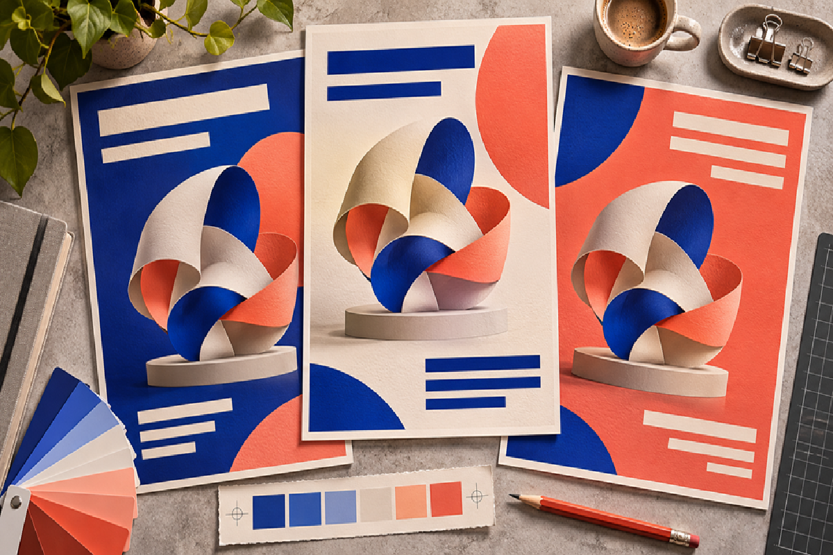
Whisk AI’s GPT Image 2.6 guide is a starting point for exploring the newer model. For teams that already have a GPT Image 2.5 workflow, the practical question is where 2.6 makes revisions easier to approve. That calls for a comparison on the same approved layout, with the same copy and the same review rules. The illustrations below explain the process; they are not benchmark outputs.
What changed from GPT Image 2.5 to 2.6?
OpenAI positions Sunburst for detailed work and Flare for faster iteration. Its release notes describe better consistency across edits for GPT Image 2.6 Sunburst at medium or high quality. The Image API also adds markup-guided editing for the 2.6 family, which gives a team a way to point at the area that needs work where the interface exposes that control. These are reasons to test an upgrade. They do not establish that every hosted interface offers the same controls or that the new model preserves every pixel.
A localized poster has three different jobs: reproduce the approved wording, make that wording fit, and leave the rest of the artwork intact. A generation can pass two and fail the third. This is why a clean-looking mockup can still be expensive to finish: it may take longer to find and correct the hidden changes than to set the new text in the original design file.
A four-step workflow for comparing poster edits
The following workflow makes the results useful to the person who has to approve and publish the poster.
Step 1: Freeze the poster master and approved copy
Save an untouched export of the master poster. Make a copy sheet with the exact strings for each language, including case, punctuation, accents, dates, and the approved names of venues. List the artwork, marks, and existing copy that must stay fixed. If one version is meant for a phone screen, record its actual display size as well as the export dimensions. Your reviewer needs to know what they are approving before they see any candidate images.
Step 2: Give both versions the same revision
Compare Sunburst with Sunburst or Flare with Flare first, where those choices are available. Otherwise, write down the actual variant and settings each interface shows. Use the same master, output shape, and instructions. For example: replace the event title in the upper-left block with the approved French title; keep the artwork, date, and footer untouched. Give each model the same number of attempts and keep every output. If you want to try markup in 2.6, run it as a separate workflow trial. Otherwise the comparison cannot tell you whether a result came from the model change or a clearer indication of the edit area.
Step 3: Review type, fit, and artwork separately
Check the wording against the copy sheet character by character. Look at the poster at the intended display size and at full resolution. At display size, pay attention to line breaks, crowding, and contrast. At full size, inspect accents, small numerals, and spacing around the edited block. Finally, align the output with the master and toggle between them to look for changes beyond the edit area. A shifted mark or a modified illustration is an art change even if the translation is correct.
Step 4: Record the work needed to get to approval
Give each proof one of three outcomes: ready for review, repairable in the design file, or rerun. Write down the first issue that blocked approval and the time required to fix it. Include the time spent checking the image and rebuilding type, not just waiting for generation. A model that delivers fewer attractive previews may still be the better choice if more of its proofs survive review and need less repair.
Where the comparison helps
Exhibition posters. An exhibition title may get much longer in translation. Keep a version with an intentionally generous text area, then ask both models to handle one short title and one that needs a second line. A clever line break is useful only if it leaves the date and venue legible.
Social cutdowns. A square crop and a tall story panel serve different viewing conditions. Compare them as separate jobs. An edit that reads comfortably on a wide proof may be too small on a phone. For any approved asset, inspect the crop and the actual destination preview before exporting the batch.
Sales and event graphics. One artwork template may carry different city names, times, or prices. The more often those facts change, the more valuable an editable text layer becomes. Keep a record of which file carries the approved data. If a model changes a time or price outside the marked block, discard that output rather than correcting the new error by hand in every derivative.
GPT Image 2.6 vs. 2.5 vs. editable typesetting
Compare the three routes by what they change, how you verify the result, and when each is worth repeating.
| Criteria | GPT Image 2.6 on Whisk AI | GPT Image 2.5 workflow | Editable typesetting |
| Starting point | Approved poster and revised copy | Existing poster and tested prompts | Master file with text layers |
| Best first trial | Local edit with crowded type | Repeat a familiar revision | Change approved copy exactly |
| What to inspect | Copy, fit, and background drift | Known failures and new drift | Reflow, spacing, font coverage |
| Useful baseline | Compare equivalent variants first | Keep prior approved outputs | Compare against source strings |
| Cost to track | Review and repair per approval | Retrying plus repair time | Layout time per locale |
| Main limitation | Rendered letters can still drift | Existing weak spots may persist | Requires editable artwork |
When the model should hand off to a designer
Imagine a gallery with a square social tile and a wide lobby display. The short French title fits the tile, but the wide version loses a letter in a small date line. Treat those outcomes as separate records. Keep the promising composition, repair the date in an editable file, and mark the wide proof as requiring manual work. That tells the team more than a single score for the whole localization job. It also prevents the apparently good result from becoming the template for the next city.
A model comparison helps most when a team needs to see several visual directions or quickly evaluate whether translated copy fits a composition. Once the approved layout exists, any text that needs precise spelling, regular updates, or accessible selection is often easier to maintain in a real text layer. Trial the newer model on the hard edits, keep the existing workflow where it already passes, and move recurring factual changes into a master file that can be checked directly.